
SAP Analytics Cloud UX Transformation
- Tsvetomir Mladenov

- Mar 21, 2024
- 6 min read
Updated: Mar 25, 2024
Join us on an exciting UX transformation as we execute transformation of a dashboard in SAP Analytics Cloud. In this post you will find a collection of ongoing series of articles on user experience for BI & Planning tools. Our goal is to enhance how we interact with data through better design.
Latest update: 25.03.2024

Introduction
In recent years, BI tools have evolved significantly, offering limitless possibilities to visualize and present data, however, humans are not always quick to adapt. We are constrained by the limitations of memory and perception, underscoring the importance of carefully crafting data screens to accommodate our cognitive abilities.
At the heart of any BI or Planning solution lies its usability - the true marker of its value. Solutions that aren't user-friendly end up forgotten, failing to make a meaningful impact on organizational information flow.
Throughout this series of articles, we'll share invaluable insights from our experiences, highlighting best practices and common mistakes.
Our product portfolio dashboard app in SAP analytics Cloud will be our canvas for this transformative journey. Together, we'll collaboratively enhance its effectiveness, tackling one component at a time.
Before delving deeper, let's briefly revisit the dashboard's original business case:
● Medium-sized fashion and sports goods company;
● Regional planners curate a product list and allocate quantities;
● Dashboard serves to summarize the results of portfolio planning for management;
● Provides visibility into portfolio coherence and efficiency;
● Facilitates managerial adjustments.
Step 1: Data Context
In this section we will shed light on the need for data contextualization and explain why it is a best practice.
In the BI world, data is only useful if we can relate it to the real world and derive meaningful insights. Visualizing data for the sake of displaying data points is meaningless, nevertheless, we often encounter such practices in modern graphical displays.
To illustrate the issue, we’ll use the Product Portfolio Dashboard’s KPI tiles which present high-level figures for Gross Sales and Quantities.

These KPI tiles do a good job of telling the users some business metrics, however, they fail to inform and provide value as they lack crucial contextual information. Is the figure good or bad? Should the focus be on selling more or less? What are the implications of the current plan? Data without context holds no significance. A single data point cannot form the basis for deductions and decisions. We cannot assume that users possess prior knowledge of the data's context.
To address this issue, our transformation begins by introducing a comparison metric to the KPI tiles. By including a deviation from last year's figures, users can better assess whether the current plan signifies business growth or decline.
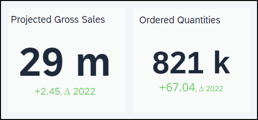
The display of this deviation already indicates the magnitude of increase or decrease in the plan. However, we must ask ourselves if this alone is sufficient. The plan for the current year needs to cater to the company’s strategic direction, represented as targets. These targets encompass both the business's ambitions and capabilities, offering users an important benchmark for evaluating the plan.

With these simple yet impactful changes, the KPI tiles now provide significantly more informative insights. Managers can gain the necessary context to assess whether the planned numbers align with their expectations, however, our transformation of those two KPI tiles is still not finished.
Step 2: Implied Data
The topic of this section is displaying implied metrics.
When our data displays are not tuned to the needs of the users, we might display the data we have available instead of the data users would like to consume. Whenever the user needs to mentally calculate a metric using the metrics supplied in a dashboard, we call this an implied metric.
Implied metrics take precious time and cognitive resources from the users and diminish the likelihood of discovering meaningful insights, so we try to avoid them.
Last time, we started the transformation of the Dashboard’s KPI times by introducing context to the main data points. While this brought value to the tiles, we can further increase it if we show it as a comparison to the base metric. High-level management often prefers to work with percentage metrics instead of absolute values. It would be much more efficient if we make this calculation in our dashboard.

Now that we got rid of the implied metrics and made the context easier to read, there is just one more step left until we finalize the transformation of the two tiles.
Step 3: Level of Detail
Our KPI tiles are now enriched with context and are showing metrics directly. Today’s topic would be to manage the level of detail those widgets carry.
Since one of the key objectives of the dashboard is to show the plan against strategic goals, we would like to add historical data on our two main metrics: Revenue and Quantity. By providing sales and quantity data for the past years, we would enhance the situational awareness of the managers that would use this graphical display.
Let’s add revenue and quantity for the last 5 years and examine the result. We’ll use a simple line chart to display the additional data.

With the addition of historical data, we’ve created a complete picture of the plan surroundings. We notice, however, that the graphical display is not really easy to read. It looks cluttered and overwhelming, and we need to take into consideration that this is just a piece of the data that we need to represent. In situations like this, we need to ask ourselves what is the job our users need to get done, what is needed for the job to be done, and what might be unnecessary noise.
Modern dashboards often try to include as much data as possible, but this is a mistake. People can only consume a limited amount of information, therefore displaying too much detail for a given use case makes no sense. In our case, we’re trying to build an overview of the portfolio plan, so there is no need to see the revenue down to cents. For our purposes, we’re better off showing the data in millions or thousands. The same point can also be applied to the percentage deviation metrics. Since we’re painting an overview picture, not a detailed sales report, we’re fine not showing decimals.

With just a few clicks, we were able to make the data more readable by excluding detail that simply had no value in the current moment.
Step 4: Media Format
In the first three articles of the series we tackled the overview KPI tiles that inform us about total projected revenue and planned quantities.
In this part we aim to transform the donut chart, which currently displays the plan split by market, into something more effective.

Donut charts are in-fashion for the past couple of decades. Their circular shape makes them stand out and they are generally perceived as better looking than the classical bar charts. Nevertheless, we ought to ask ourselves: Do they convey information effectively?

The straightforward answer is "No”. They are primarily used to visualize comparisons, yet they fall short as humans are not as good at determining the size of circular and curved shapes as they are with linear ones. The more segments a pie chart has the less are people able to judge the size of each one. Even If the segments are ordered by size it is still difficult to find out how much bigger is one segment than another.

Moreover, frequently donut chart sectors are represented by different colors and quite often there is not enough space to display labels next to the data sectors in pie and donut charts. This necessitates the use of a legend which are generally ineffective as users need to constantly divert their attention to the legend. It is also worth mentioning that color is one of the least precise for visual attributes and it needs more processing than position or length for example. Donut and Pie charts do have their limited use cases, but they are not what we need right now.
Taking those limitations in mind let’s try to re-imagine the widget as a bar chart.

Using this view we can now easily compare the revenue size per market. The axis labels are easy to read, so we don’t need a legend or a tooltip and we also can easily show the data points next to the bars.
This is a real improvement on readability, but there’s still one additional UX optimization trick that we can apply to this chart in the next post. Stay tuned and follow the series to find out what it is!


Comments